Bulgar Biotic is a producer of new generation probiotics. The company's production is based on old Bulgarian traditions and the latest innovations in technology.
In regard to the launch of a new series of probiotic products, Bulgar Biotic assigned us to create the name and the overall vision of the product line.
The Result
The company's probiotics turned out to to have not only numerous health benefits but also a great flavor. That is why we wanted to create a name that would distinguish them from other probiotic products and reflect the positive values of the brand.
Thus appeared Bactojoy - a name that acts as a word game with the main feature of the product - the presence of beneficial bacteria and the end result - health and joy. Another advantage is that it could be also read as "back to joy".
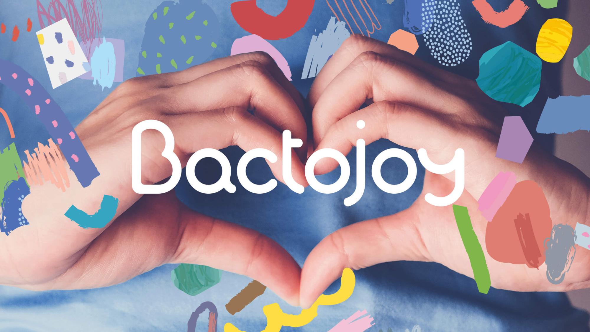
We built the brand logo by creating an entirely typographic logo with round shapes.
We built the brand logo by creating an entirely typographic logo with round shapes.
In addition, we complemented the vision of the brand with illustrations of the main ingredients in the products.
The end result was a catchy product line that impresses with its positive modern design and its delicious beneficial qualities.
Happy with our work, Bulgar Biotic commissioned us to develop the design of its next line of probiotic products.
We did not betray the brand's vision and we relied on illustrations again. That's how Bactosaur, the main character in Bactojoy Babies and Kids, appeared.
We also developed a company website with a modern design, in correlation to the brand vision.
The website also functions as an online store and allows quick and easy purchase of the products.